Web Design Guidelines
I. About
The LoneStar.edu style guide is essential documentation for contributors working on the website, enforcing standards for a consistent design across its numerous pages. It serves as a reference for content authors, web designers, information architects, and developers, ensuring accountability and guiding the addition or modification of content.
Please note that myLoneStar, iStar, Employee Intranet, SharePoint, D2L and Portal services are a separate portal and all pages are managed through the Office of Technology Services (OTS).
II. What to Avoid
Logos - Avoid adding logos on images. The website already has a LSC logo on it and additional logo usage is not necessary.
QR Codes - Avoid adding QR codes on images. QR codes on the website are not feasible on websites, especially on mobile devices. If you have an event that has a link, please provide that link on the webpage itself and attach the event information as a PDF on the site instead.
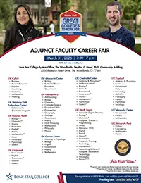
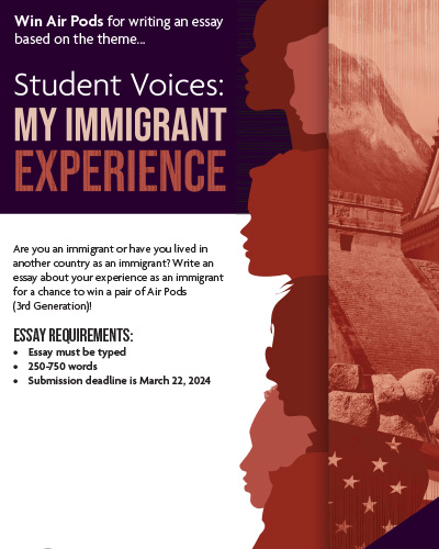
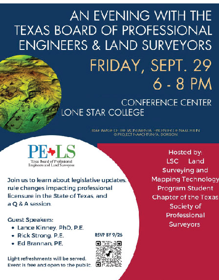
Posters/Flyers - Uploading posters/flyers as an image on web pages is strongly discouraged due to ADA violations. Poster text is not picked up by screen readers, limiting accessibility. It's best practice to type out important event information directly on the website or provide a link to the PDF version of the flyer. This improves accessibility and ensures everyone can access the details.

GIFs - Avoid using GIFs on websites due to ADA concerns and accessibility limitations. Screen readers may not interpret GIFs, impacting content reach. To ensure a more inclusive user experience, consider providing essential information in text format on the website.

Borrowing Code - DO NOT BORROW CODE. Avoid using code from other sources, whether within LSC or external websites. Do NOT alter templates. If you need a page redesign or additional features, submit a ticket to the Web Services team using the provided link. A web designer will contact you and guide you through any web needs.
Third-Party Code Review Policy - Before adding any outside (third-party) code or tools to a college website, you must submit it to the Web Team for review at least 10 business days in advance.
Please note: Review time may be longer depending on how complex the code is.
This applies to anything that comes from an external provider or service, including (but not limited to):
- Embedded videos (like YouTube or Vimeo)
- Online games or interactive tools
- iFrames (embedded web pages or widgets)
- Scripts or tracking tools (analytics, chatbots, etc.)
- External applications or plugins
- Social media feeds or embedded posts
- Any other content or features hosted outside the college’s website
When you submit your request, include all relevant technical details so the Web Team can properly review it. The Web Team will evaluate each request based on things like:
- Scope and purpose
- Security and data privacy
- Accessibility (making sure it works for all users)
- Website performance (page speed and reliability)
- Compliance with college standards
After review, the Web Team will provide detailed reasons for approval, requested changes, or reasons for denial.
III. AI & LLM Use in Web Content
The use of artificial intelligence (AI) tools, including large language models (LLMs) such as ChatGPT, must support Lone Star College System’s commitment to accuracy, accessibility, and professionalism.
-
Purpose
The use of artificial intelligence (AI) tools, including large language models (LLMs) such as ChatGPT, must support Lone Star College System's commitment to accuracy, accessibility, and professionalism.
-
Requirements
- Accuracy & Verification: All AI-generated text must be fact-checked and aligned with official Lone Star College System information and policies.
- Accessibility: Ensure that any AI-assisted content (text, media, alt text) follows accessibility guidelines.
- Human Oversight: Final responsibility for the accuracy, clarity, and appropriateness of content lies with YOU. Please review the content instead of just copy and pasting what is given to you.
- Originality: AI-generated content must be reviewed for plagiarism risks. We strongly suggest you revise the content as needed to avoid this risk.
-
Best Practices
- Use AI for drafting and ideation, not for final publishing.
- Always proofread, edit, and fact-check before submitting the content.
- Cross-check against official sources: Verify all facts, dates, program detail, official documents, or departmental contact information.
- Creating imagery: AI-generated images must comply with LSCS copyright, branding, and accessibility standards.
-
Prohibited Uses
- Submitting AI-generated text directly to Web Services without review.
- Using AI tools to create or alter official policies, procedures, or legal statements.
- Replacing subject matter expertise: AI cannot substitute for faculty, staff, or departmental authority on academic programs or institutional services.
IV. Image Use and Styling
NOTE: Use of copyrighted images without proper permission or licensing is prohibited. Unauthorized use, copying, or distribution may violate copyright law and result in fines, penalties, or legal action. All users must ensure that images used on this site are properly licensed, in the public domain, or used with the copyright holder’s permission.
Alt Text
Alt text (alternative text) describes an image on a page. Alt text helps visually impaired people understand what the image shows, helps search engine bots understand image contents, and appears on a page when the image fails to load.
Alt Text for Images- Every image should have descriptive and concise alternative text (alt text).
- Alt text should convey the purpose and content of the image.
- DO NOT put all your event information in the alt tag. Alt text is to describe the image not the content of the image
- Avoid using generic phrases like "image" or "picture" as alt text.
- Alt text should provide meaningful information, especially if the image conveys important content or context.
- Images used as links or buttons should have descriptive alt text that indicates the purpose or destination.
Image Sources
Please reach out to your College Relations team to find out what resources are available to help you download images or find the image you need.
Image Content:
- School appropriate
- Paid images to avoid any copyright claims
- Don't download random images from Google
- No name brands (Super Mario, Disney, etc...)
Image Sources:
- Shutterstock: https://www.shutterstock.com/
- iStock: https://www.istockphoto.com/
- Any stock images
- Any LSC image as long as students have signed the model release form
- Free Image resources: Unsplash, Pexels, Pixabay
A. Campus Home Pages
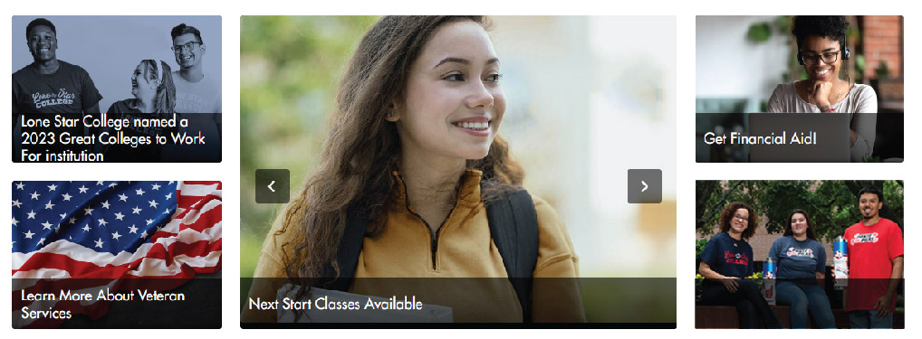
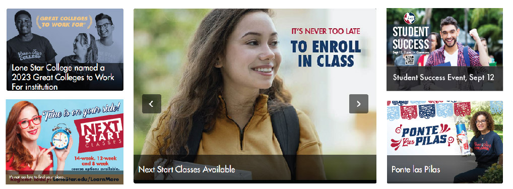
The features section is designed to highlight a variety of content including events, programs, news, services, and registration. The number of features defaults to five elements, each which contain a photo/image with limited decorative text on them, and a short headline and subheading on the bottom.
Required Picture Specifications
- Size: 850px width by 600px height
- Resolution: 72 dpi
- File Size: File should be less than 200KB
- Accepted file types: WebP, JPG
Do
Don't
- Excessive text on the image
- Logo usage
- QR code usage
- Lots of visual clutter
- Repetitive on image and overlay
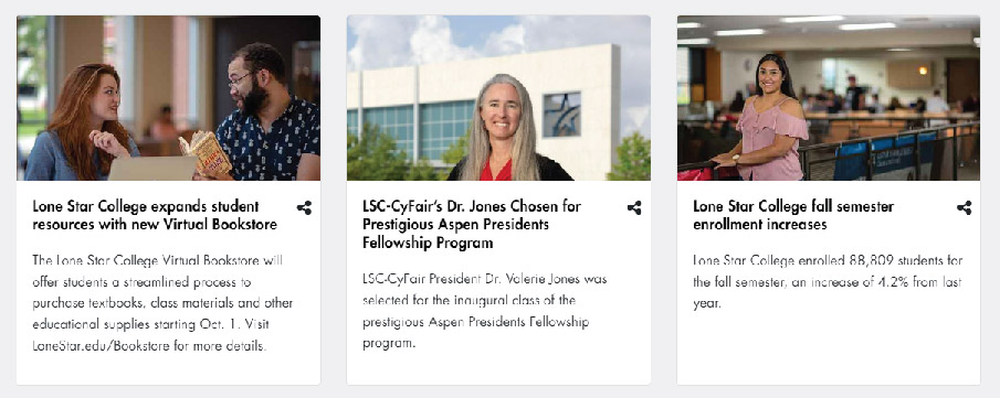
B. News/Event Tiles
The news section is designed to highlight any Campus or LSC news and stories. The number of features defaults to six elements, each which contain a photo(images with no text), a Title section and an area to add a short description of the article featured. Article placement is determined by the web author and can be changed as needed using the GUIID.
Required Picture Specifications
- Size: 550px width by 367px height (Height can vary as long as width is 550px)
- Resolution: 72 dpi
- File Size: File should be less than 200KB
- Accepted file types: WebP, JPG
Do
Don't
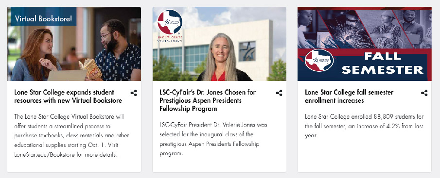
- Excessive text on the image
- Logo usage
- Too much visual clutter
- Repetitive on image and overlay
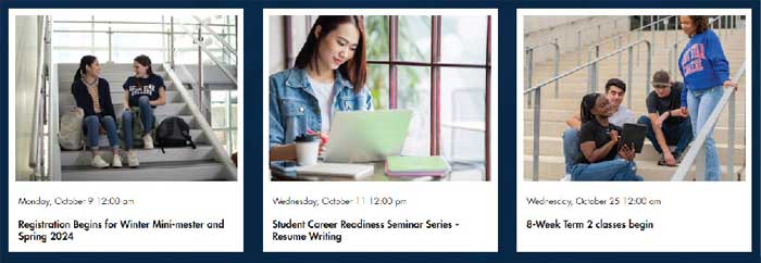
C. Calendar
The calendar section is designed to highlight a variety of events happening through your campus or LSC as a whole. The number of features varies, each card contains a photo image with no text on it and the details for your event.
You are responsible for adding your own events and creating your own profile. Please use your Lone Star College email. All events are reviewed and published by the Campus College Relations team.
Required Picture Specifications
- Size: Can vary between 730px width by 480px height up to 850px width by 600px height (Notes: Large images at the upper range will be cropped, please avoid excessive text)
- Resolution: 72 dpi
- File Size: File should be less than 200KB
- Accepted file types: WebP, JPG
Do
Don't
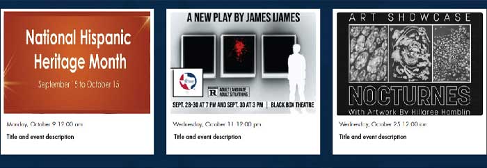
- Logo usage
- Using a flyer as the calendar image
- Excessive text
- Too much visual clutter
D. Web Pages
Webpages are designed to present a variety of content, ranging from events to informational details. Their layout can vary, incorporating distinct elements like images or cards that highlight important information. The primary objective is to ensure a user-friendly and engaging experience for visitors.
Required Picture Specifications
- Banner Size: 750px/800px width by 350px height
- Contact Card Size: 250px width by 375px height
- Resolution: 72 dpi
- File Size: File should be less than 150KB
- Accepted file types: WebP, JPG
Do
Don't
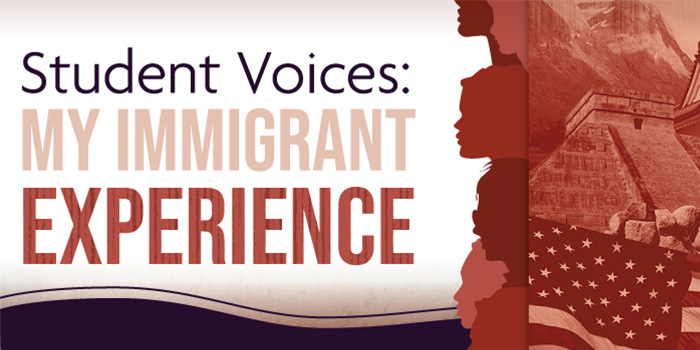
Flyers contain unnecessary text and are hard to read by all types of users at smaller sizes. Using a flyer as your call to action is a poor way to communicate a clear direction to the user. Information on flyers is not picked up by screen readers therefore making flyers non ADA compliant which may result in poor turnout for your events.
- Too much text hard to read at various screen sizes
- Not ADA compliant
- Hard to find important information quickly
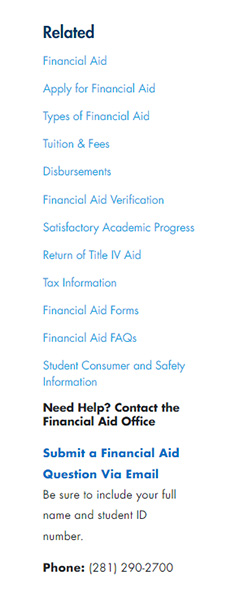
Sidebars are commonly used to enhance user experience by offering easy access to related content, menus, or important features, making it convenient for visitors to explore the website. Think of sidebars are where you want to put secondary/tertiary information.
| Do | Don't |
 |
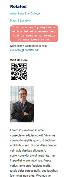 |
- Avoid using too much excessive text
- Do not put in-depth information in the sidebar
- QR codes and images are prohibited
- Note: On mobile devices, sidebar information is moved to the bottom of the screen
V. Text Styling
Dos
- Consistent Font Sizes: Maintain consistent font sizes for a cohesive look.
- Whitespace: Use ample whitespace to enhance readability and avoid clutter.
Shift+Enter = Single space, Enter = Double Space - Hierarchy: Apply heading tags (h2, h3, etc.) to create a visual hierarchy.
- Line Length: Keep lines of text at a moderate length for comfortable reading.
Don'ts
- Inconsistent Font Sizes: Avoid abrupt changes in font sizes that may confuse readers.
- Excessive Italics or Bolding: Limit the use of italics and bolding for emphasis to prevent visual overload.
- Long Paragraphs: Break up long paragraphs to make the text more digestible.
- Ignoring Accessibility: Don't overlook accessibility considerations, such as ensuring text is readable for users with visual impairments.
VI. Button Styling
Dos
- Clear Call-to-Action (CTA): Ensure buttons have a clear purpose and guide users with a specific action.
- Consistent Styling: Maintain a uniform design for buttons throughout the website for a cohesive look.
- Adequate Size: Buttons should be large enough to click comfortably but not too overwhelming.
- Whitespace: Leave enough space around buttons for clarity and to avoid visual clutter.
- LSC Buttons:
Blue Button White Button White Button Outline
Graphic button example:
Images with simple designs and short text may be used in place of a traditional button. However these images would still require alt text. Please use sparingly and keep contrast, font size, and image size in mind when using this option.

Example graphic button size: 150 x 93 px, 72 dpi, font size 20
Don'ts
- Flyers/PDFs Thumbnails: Don't use a thumbnail of a file as a button, replace them with a link or an actual button.
- Vague Labels: Avoid using unclear or confusing button labels that don't convey the intended action.
- Tiny Buttons: Avoid making buttons too small, which may lead to misclicks, especially on touch devices.
- Cluttered Placement: Don't overcrowd buttons; leave enough space around them for clarity.
 |
 |
 |
 |
VII. Publishing Pages
Once content is released for publication, the update will be included in the next batch publishing job, which currently runs every night Monday through Saturday. If content must be published immediately in the case of emergencies or time-sensitive materials, please contact the LSC Web Services Team at SO-WebServices@LoneStar.edu.